01 / The challenge
The presentation needed to communicate beauty and care without overwhelming the subject. Colour, image and supporting details had to work as one composition.
A softer expression.
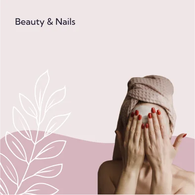
The Beauty & Nails portfolio artwork explores a softer visual language for a beauty business. Photography, botanical linework and a restrained colour palette set the tone.
The presentation needed to communicate beauty and care without overwhelming the subject. Colour, image and supporting details had to work as one composition.
Muted rose and neutral tones create a quiet backdrop. Fine botanical linework balances the photographic focal point, while a simple wordmark keeps the business name legible.
A visual direction showing how colour, photography and illustration can support a coherent brand presentation. This project is presented as a design study.
A website. An app. A smarter way of working. Tell us what you have in mind and we’ll come back within two days.
Start a conversation